Introduction: Why Reporting in Salesforce is Mission-Critical
In the dynamic realm of CRM, reporting isn’t just about data—it’s about insight, foresight, and action. Salesforce reports empower administrators to drive productivity, monitor KPIs, and deliver value to every department. As the Salesforce ecosystem continues to evolve, knowing which reports to leverage can transform your entire org’s performance.
Whether you’re monitoring pipeline health, surfacing operational inefficiencies, or presenting insights to the C-suite, the ability to harness Salesforce reporting is no longer optional. It’s a strategic skill. This blog explores the top 5 Salesforce report types every admin should master, arming you with the analytical power to make data-driven decisions that matter and create high-performance outcomes across the board.
When building Lightning Web Components (LWC), each file serves a unique purpose, and together they define how the component works inside Salesforce. Furthermore, understanding these files early ensures smoother development and deployment.
- HTML File: Acts as the template, written in standard HTML5 with additional LWC directives for dynamic rendering.
- JavaScript File (JS): Handles business logic, data binding, and lifecycle hooks for component behavior.
- Meta XML File: Declares visibility settings, defining where the component can appear, such as App Pages or Record Pages.
1. Tabular Reports — The Power of Simplicity in Salesforce Reporting
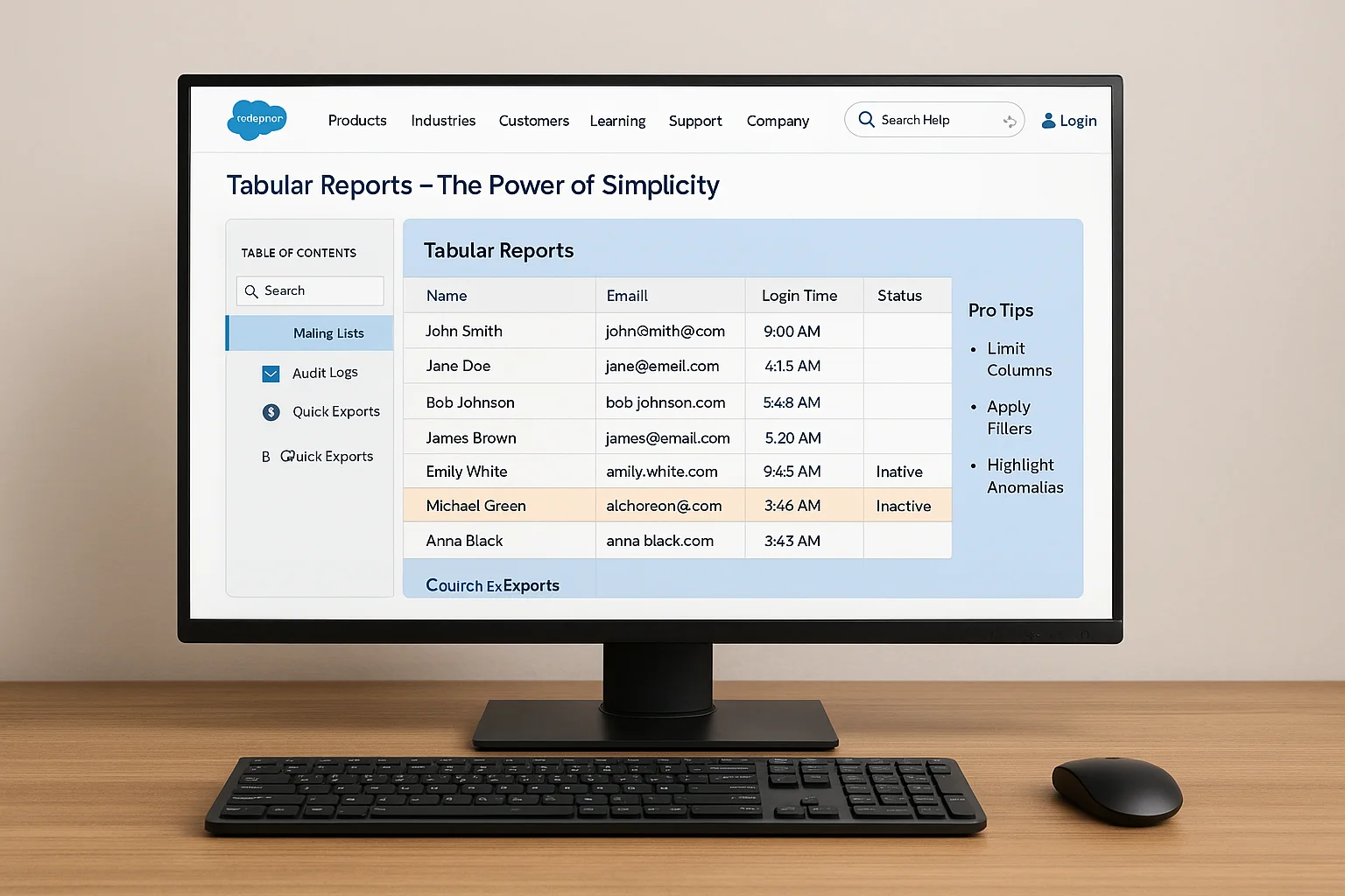
Tabular Reports are the most basic format in Salesforce—think of them as Excel-style rows and columns. They deliver a clean, linear list of records without grouping or sub-totals.
Use Cases:
- Exporting data quickly
- Generating mailing lists
- Tracking audit logs and login histories
Pro Tips:
- Keep the number of columns limited to enhance clarity
- Always apply filters to retrieve only relevant data
- Add conditional formatting to call out anomalies or critical rows
These reports are perfect for quick data reviews and simple exports. If you’re transitioning from spreadsheets, this is your launchpad. Their simplicity allows you to surface raw datasets fast—ideal when performing audits or compliance checks.
2. Summary Reports — Group, Count, and Compare Your Salesforce Data
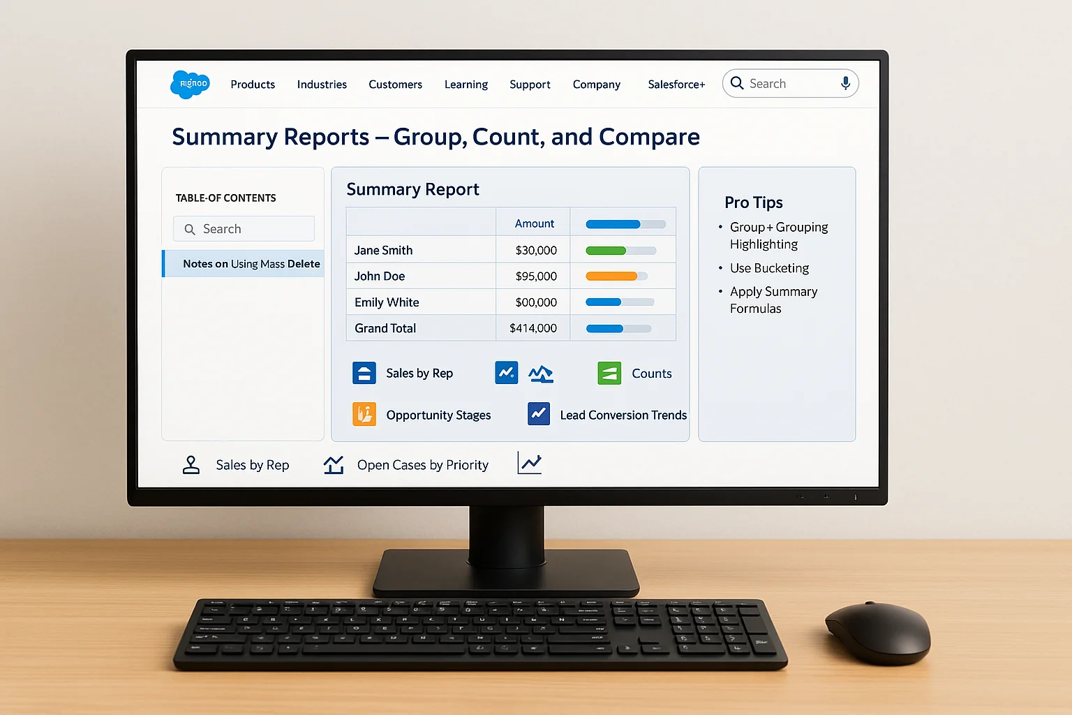
Summary Reports go a step further by allowing grouping of rows based on fields like Account, Owner, or Status. You can then apply metrics like totals, averages, or record counts.
Use Cases:
- Reviewing sales performance by representative
- Monitoring open cases by priority
- Analyzing opportunity stages
- Weekly lead conversion analysis by source
Pro Tips:
- Combine grouping with conditional highlighting to boost readability
- Use bucketing to reclassify field values into custom categories
- Leverage summary formulas for calculated metrics like win ratios
This is the go-to format for most departments aiming to spot patterns and identify performance gaps. Summary Reports make trend identification intuitive—especially when time-framed filters are used.
3. Matrix Reports — Cross-Analyze Salesforce Metrics with Precision
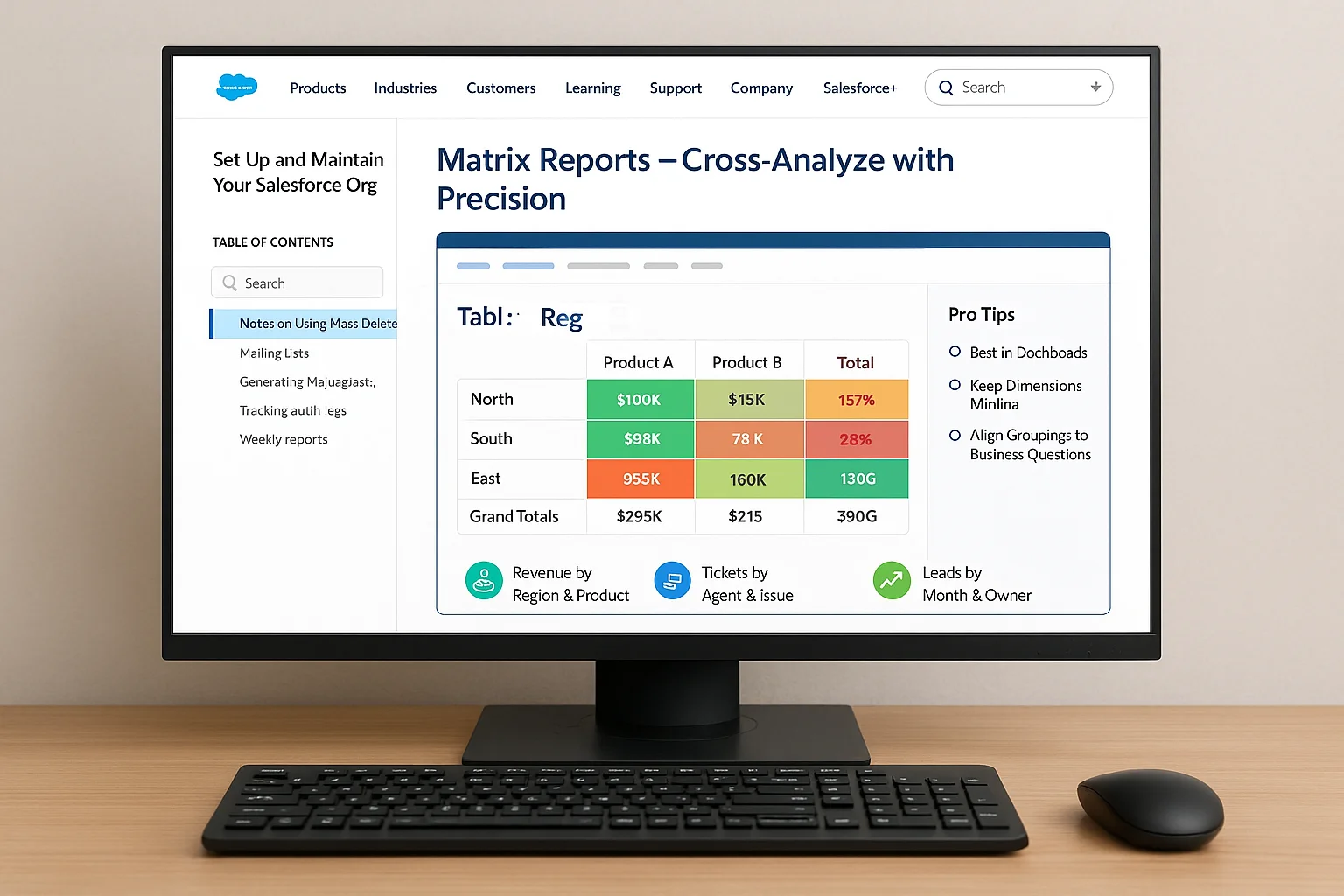
Matrix Reports group records by both rows and columns, giving you multi-dimensional comparisons. This is especially useful when senior leadership wants a clear, comparative view of how multiple segments perform against multiple metrics.
Use Cases:
- Quarterly revenue segmented by region and product
- Support ticket trends by agent and issue type
- Lead performance by month and owner
Pro Tips:
- These reports shine best when viewed inside dashboards
- Keep dimensions minimal for easier readability
- Align row/column groupings based on business questions
Matrix Reports unlock layered analysis that supports strategic decisions. They can be your north star for complex business reviews.
4. Joined Reports — Merge Salesforce Objects for a Unified View
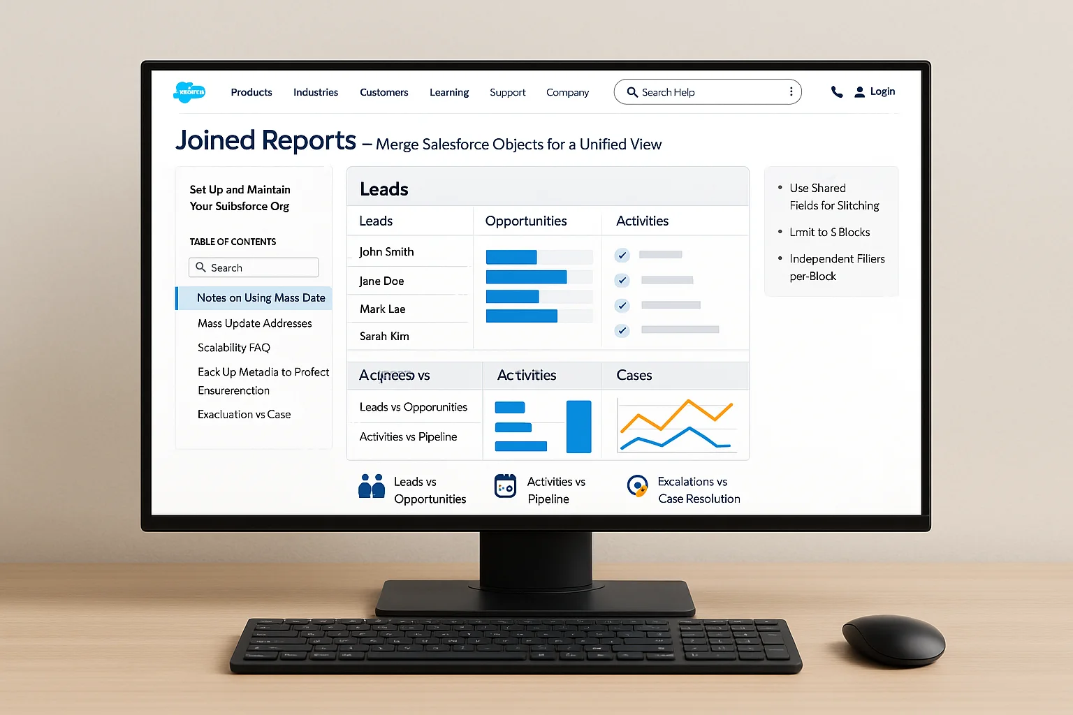
Joined Reports let you combine data from multiple report types or objects, displayed in separate blocks under one canvas. They’re ideal for comparing data that lives across different objects.
Use Cases:
- Comparing Leads vs. Opportunities
- Tracking Activities vs. Pipeline metrics
- Support Escalations vs. Case Resolution Time
Pro Tips:
- Use shared fields to stitch together multiple blocks
- Limit to 5 blocks to avoid visual clutter
- Each block can have independent filters and formats
For data-rich teams, these reports connect dots across silos. If you’re integrating systems via API, understanding how data flows between blocks is critical. Read the Salesforce REST API Integration Guide for Beginners.
5. Custom Report Types — Tailor Salesforce Reports to Your Org
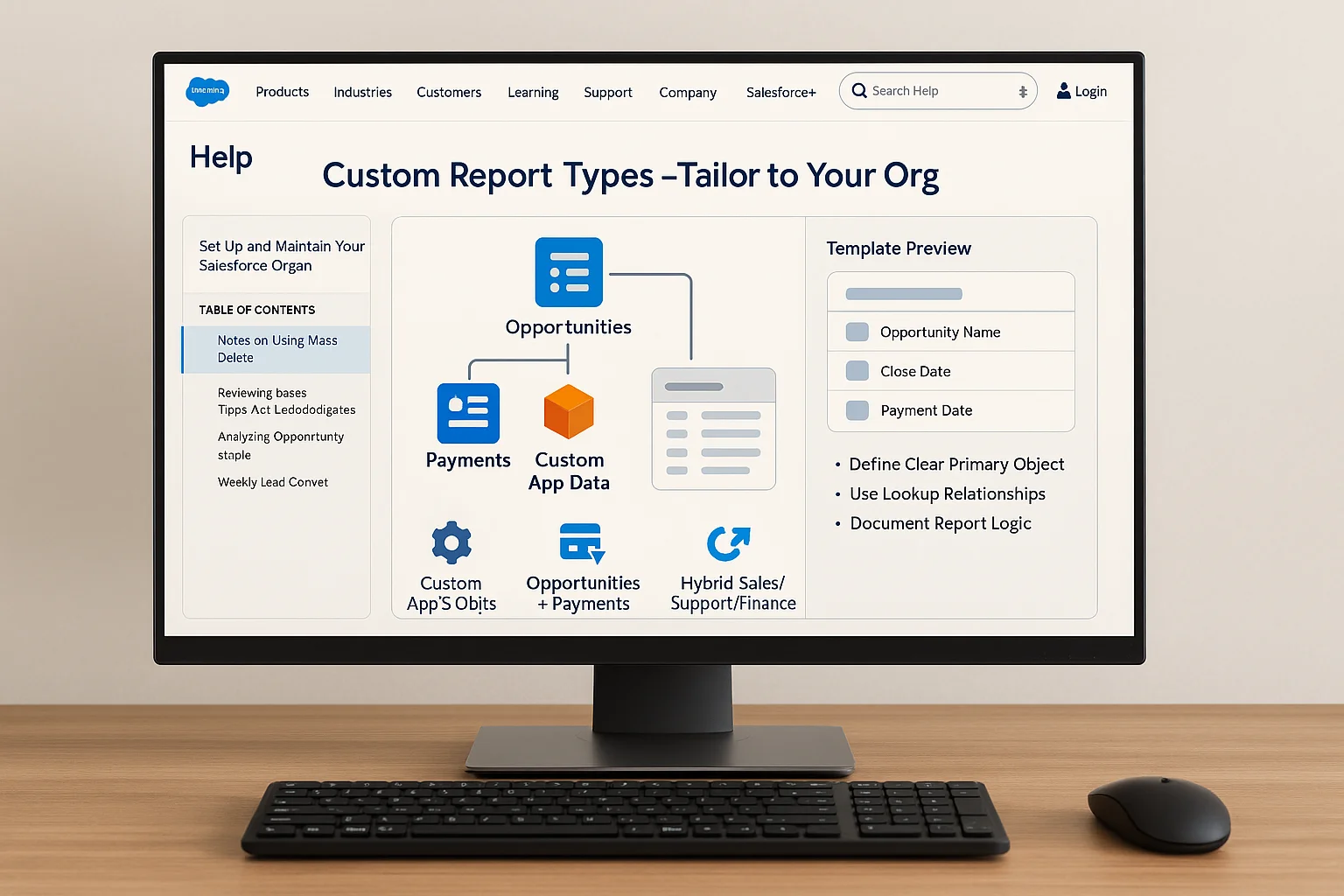
Custom Report Types (CRTs) let you define which objects, fields, and relationships are included in your report templates—especially useful for custom objects and unique workflows.
Use Cases:
- Reporting on custom apps and objects
- Merging Opportunities with custom Payment records
- Building hybrid views across sales, support, and finance
Pro Tips:
- Always define a clear primary object
- Use Lookup Relationships to pull related object fields
- Document report logic for consistency and training
They’re a must-have tool for advanced admins, particularly in sales environments.
6. Salesforce Admin Best Practices for Scalable Reports
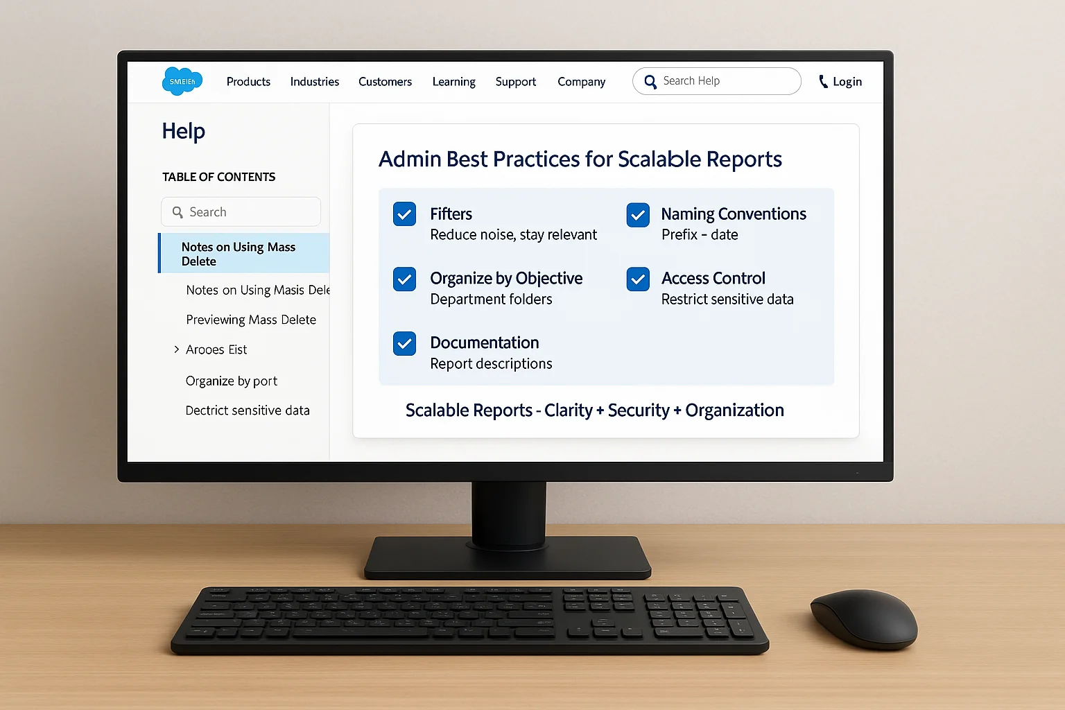
To build reports that grow with your org:
- Filters are your best friend: Over-filtering reduces noise and enhances relevance.
- Naming conventions matter: Use consistent prefixes and dates in names.
- Organize by objective: Group reports in folders by department or goal.
- Access control: Ensure only necessary users can access sensitive data.
- Add documentation: Use report descriptions to convey purpose clearly.
As you scale reporting, these foundational habits will support governance, usability, and adoption across teams.
7. Visualize Salesforce Reports with Dashboards
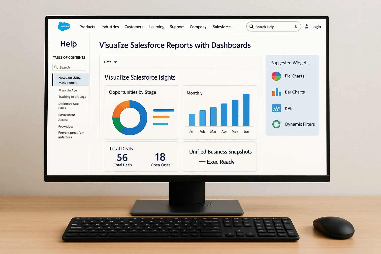
Pairing reports with dashboards makes data consumable at a glance. Dashboards translate numeric data into visuals for execs and teams.
Suggested Widgets:
- Pie charts to show segment distribution
- Bar charts to track progress over time
- Metrics widgets for quick KPIs
Dynamic filters and date ranges keep your dashboards agile and current. Layer in reports from multiple teams to create unified business snapshots.
8. Avoid These Salesforce Reporting Mistakes
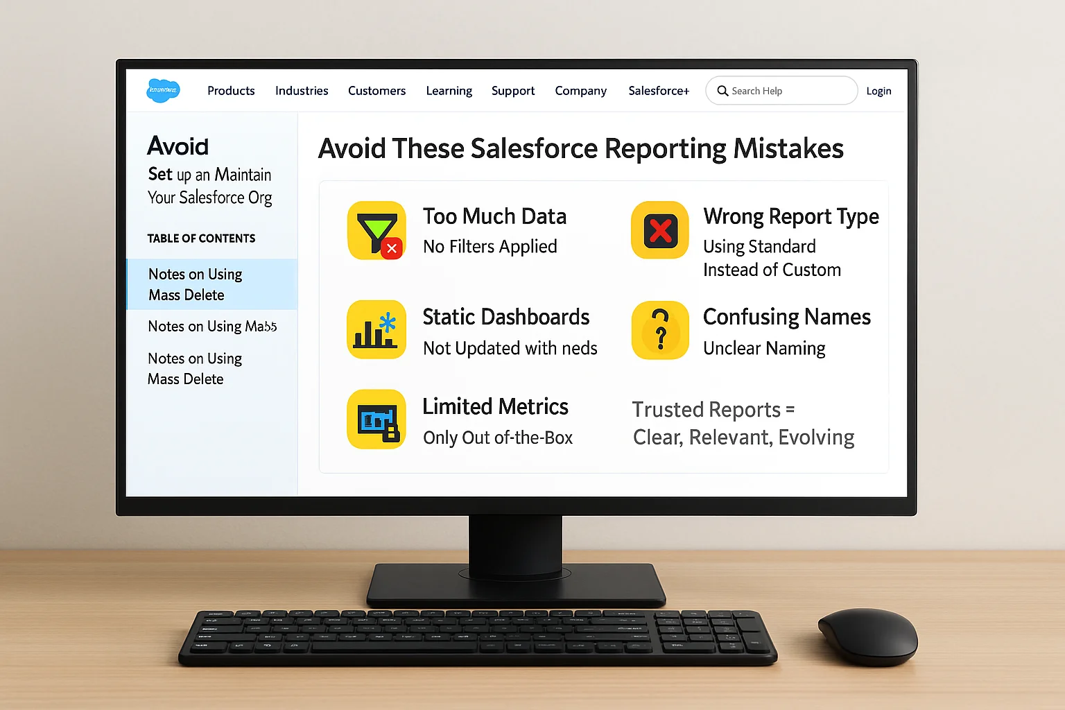
Common Pitfalls:
- Including too much data with no filtering
- Using standard types where custom ones are needed
- Static dashboards that don’t evolve with needs
- Unclear report naming leading to confusion
- Relying only on out-of-the-box metrics
Avoid these, and your reports will not only be used—they’ll be trusted.
9. Salesforce Report Use Cases by Department
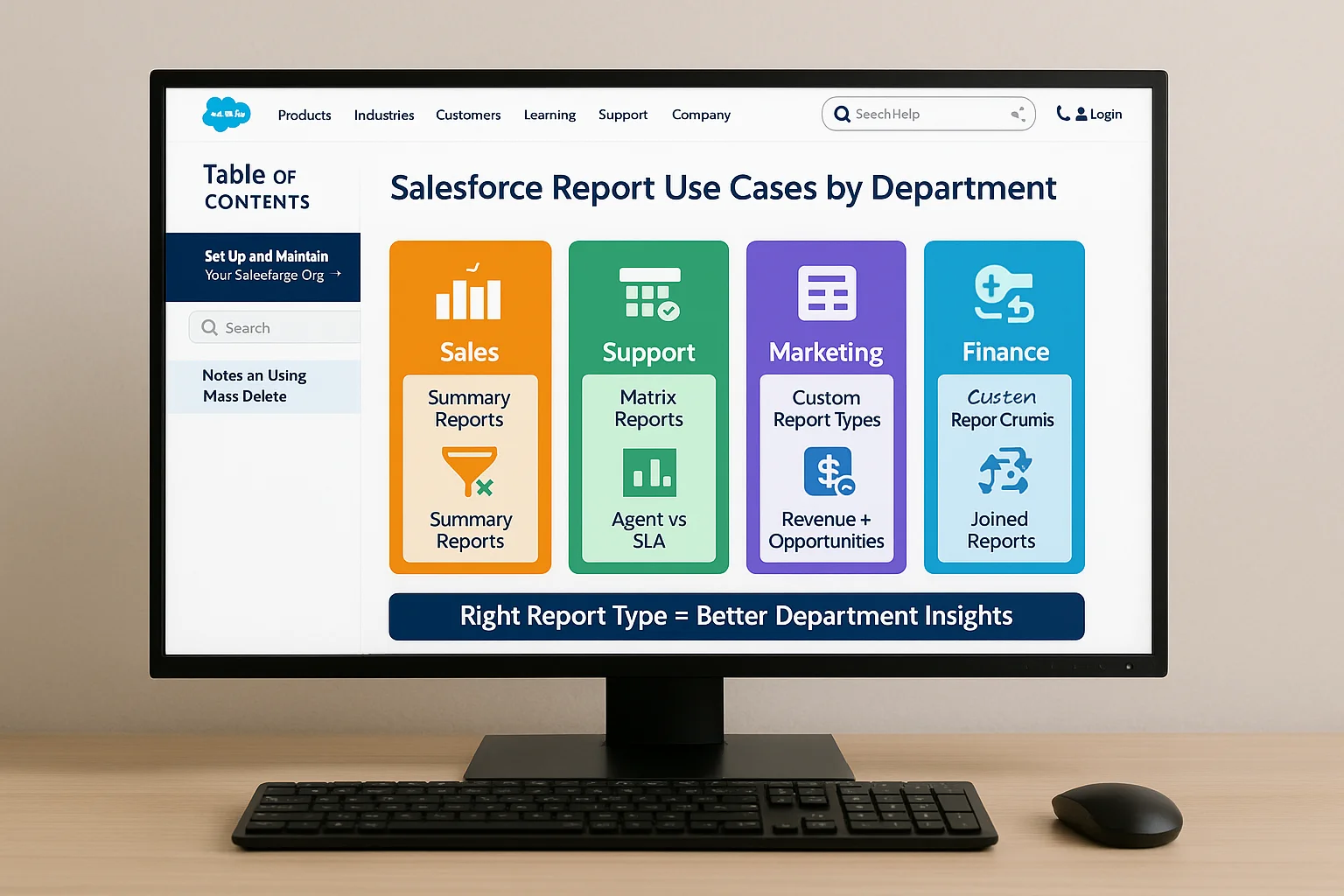
- Sales: Use Summary Reports to monitor deal stages, territory wins, and conversion velocity.
- Support: Matrix Reports to visualize volume trends per agent, SLA breaches, or case categories.
- Marketing: Tabular Reports for clean campaign exports and ROI drilldowns.
- Finance: Use Custom Report Types to align product-level revenue with opportunity data.
- Ops & Product: Joined Reports for cross-functional issue tracking and feature feedback aggregation.
The more context-specific you make it, the more actionable it becomes.
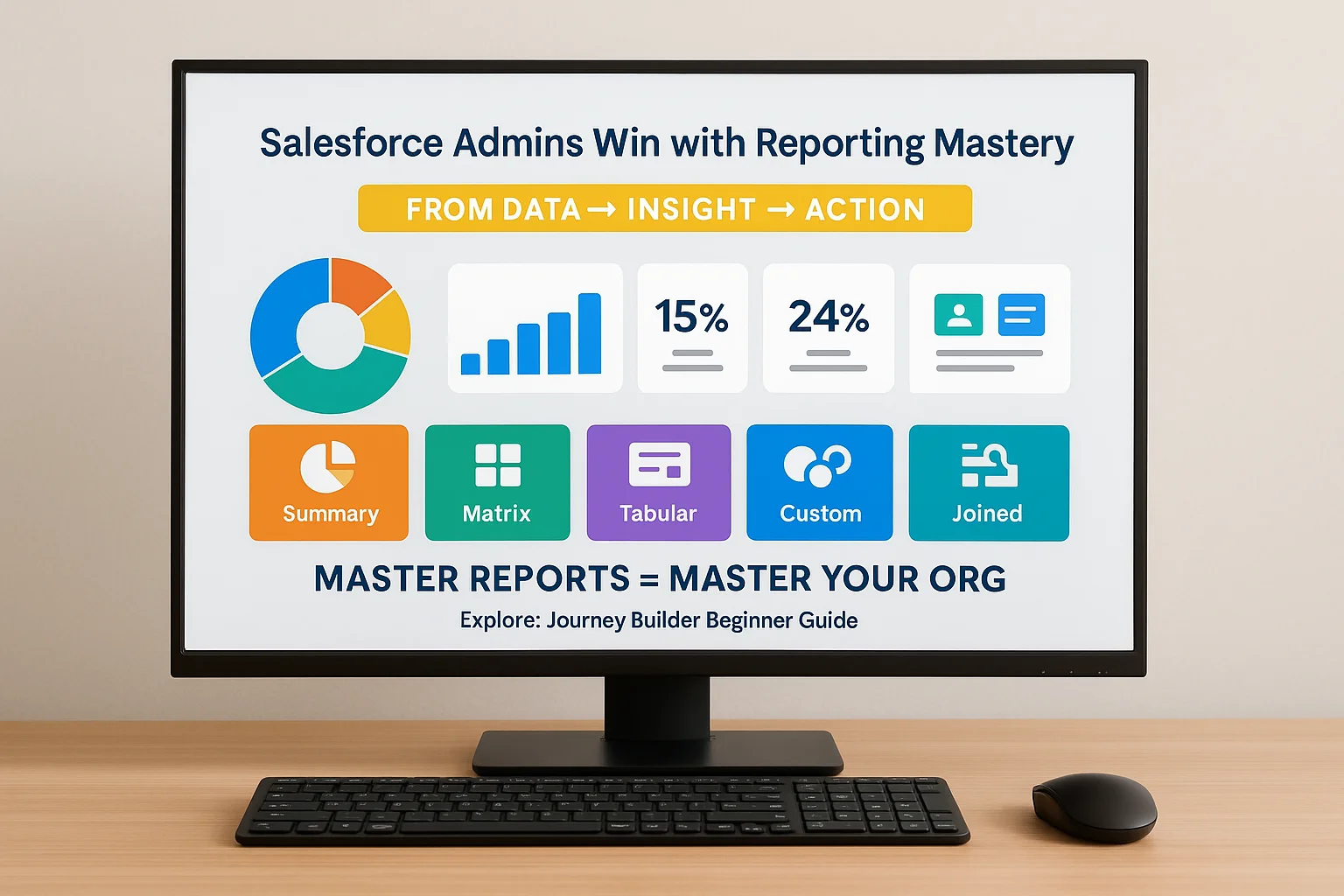
10. Conclusion: Salesforce Admins Win with Reporting Mastery
Becoming an effective Salesforce admin means more than just generating reports—it means creating a culture of intelligent reporting.
From basic exports to fully custom data stories, these five report types give you the flexibility and control you need. When combined with dashboards, they don’t just inform—they inspire action. Read Setting Up Journey Builder: Beginner Guide to explore a powerful marketing automation example that pairs well with reporting frameworks.
Master reports, and you master your org.
FAQs
What is the difference between Summary and Matrix Reports?
Summary reports group by one dimension; Matrix reports add a second grouping.
Can I use formulas in reports?
Yes—Salesforce supports row-level and summary formulas inside reports.
How do I schedule reports in Salesforce?
Click on “Subscribe” within the report to set email delivery preferences.
Are custom report types necessary for standard objects?
Only when standard options don’t offer the relationships or fields you need.
Can I create reports across unrelated objects?
Yes, with Joined Reports or by building custom relationships between objects.