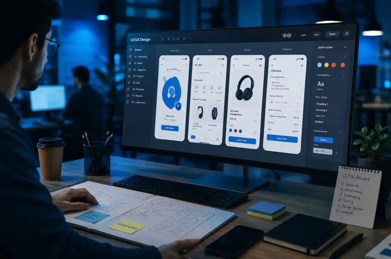
UI/UX design turns business goals and user needs into a product experience that people can understand, navigate, and use efficiently. For SaaS platforms, portals, mobile apps, dashboards, and digital products, strong design is not only about visual polish. It affects onboarding, task completion, accessibility, adoption, support burden, and the quality of the final engineering handoff.
A practical UI/UX process should connect research, information architecture, interaction design, prototyping, visual design, design systems, accessibility, usability testing, and developer collaboration. This guide explains how those stages fit together and what each one should produce.
In this guide 20 sections
- UI/UX product design process at a glance
- Start with the product problem, not the screen
- Use user research to validate assumptions
- Map journeys and task flows before creating detailed UI
- Define information architecture early
- Wireframes should solve structure before style
- Use prototypes to test interaction before engineering
- Visual design should reinforce hierarchy and action
- Design systems reduce inconsistency and implementation friction
- Design accessibility from the beginning
- Usability testing should focus on real tasks
- Design responsive behavior explicitly
- Use content design to reduce interface complexity
- Connect UI/UX design to MVP scope
- Prepare designs for engineering handoff
- Design and development should collaborate before handoff
- Measure UX with product outcomes
- UI/UX design checklist
- Frequently asked questions
- Final takeaway
UI/UX product design process at a glance
| Stage | Main objective | Typical outputs |
|---|---|---|
| 1. Discovery | Understand business goals, users and constraints | Goals, assumptions, stakeholder inputs, risks |
| 2. User research | Understand behaviors, needs and pain points | Interview findings, personas, journey insights |
| 3. Information architecture | Organize content, workflows and navigation | Site maps, task flows, navigation structure |
| 4. Wireframing | Define layout and interaction logic | Low-fidelity screens and flow states |
| 5. Prototyping | Test interaction before development | Clickable prototypes and test scenarios |
| 6. Visual design | Create the product’s visual language | UI screens, typography, color, component styling |
| 7. Design system | Create reusable patterns and tokens | Components, tokens, states, usage rules |
| 8. Usability testing | Validate whether users can complete tasks | Findings, severity levels, prioritized fixes |
| 9. Handoff | Prepare implementation-ready design | Figma specs, assets, states, interaction notes |
Start with the product problem, not the screen
Good design begins with the problem the product is meant to solve. Jumping directly into screens often creates polished interfaces around unclear workflows or weak assumptions.
Discovery should clarify the user groups, core tasks, business goals, existing workflows, technical constraints, accessibility needs, and what success should look like.
Our UI/UX design services focus on product discovery, interaction design, visual systems, prototyping, accessibility, and design-to-development handoff.
Use user research to validate assumptions
User research does not always require a large formal study. The depth should match the product risk and the maturity of the team’s existing knowledge.
Useful inputs can include interviews, support tickets, analytics, sales feedback, onboarding data, search behavior, usability recordings, customer complaints, and observation of existing workflows.
The objective is to understand what users are trying to achieve, where they struggle, and which assumptions need evidence before design decisions are locked.
Map journeys and task flows before creating detailed UI
Journey maps and task flows help teams see how a user moves from intent to completion. They expose unnecessary steps, handoffs, dead ends, and information gaps before those problems become embedded in visual design.
For workflow-heavy products such as SaaS platforms, internal tools, portals, and dashboards, task clarity is often more important than decorative UI.
Define information architecture early
Information architecture determines how screens, navigation, content, and product areas are organized. A weak structure forces users to remember where things are. A strong structure makes the product predictable.
Useful techniques include card sorting, tree testing, navigation audits, content grouping, object modeling, and task-based menu design.
Wireframes should solve structure before style
Wireframes are useful when teams need to validate layout, hierarchy, navigation, and interaction without spending time on visual detail. They allow faster iteration when requirements are still changing.
High-fidelity design too early can make teams reluctant to change a weak workflow because too much effort has already been invested in polish.
Use prototypes to test interaction before engineering
Clickable prototypes help validate navigation, task completion, edge cases, and expectations before code is written. They are especially valuable for onboarding, multi-step workflows, dashboards, permissions, forms, checkout, and complex approval flows.
Prototypes should include enough realistic behavior to answer the design question being tested. They do not need to simulate the entire final product.
Visual design should reinforce hierarchy and action
Color, typography, spacing, icons, imagery, and motion should help users understand what is important, what is interactive, and what state the product is in.
Visual design becomes less effective when every element competes for attention. Strong interfaces use hierarchy to guide the eye and reduce decision effort.
Design systems reduce inconsistency and implementation friction
A design system is more than a component library. It combines reusable components, design tokens, accessibility rules, states, interaction patterns, documentation, and governance.
Design systems are especially useful when several designers and developers work across a growing product. They reduce repeated design decisions and make changes easier to propagate consistently.
Useful system elements include color tokens, typography, spacing, grids, icons, buttons, inputs, forms, tables, navigation, alerts, dialogs, loading states, empty states, error states, and responsive behavior.
Design accessibility from the beginning
Accessibility should influence color contrast, focus states, keyboard navigation, form labels, error handling, content hierarchy, motion, touch targets, and responsive behavior.
Accessibility added at the end often creates rework. Designing around accessible components and states from the beginning makes implementation more consistent.
Usability testing should focus on real tasks
Usability testing evaluates whether representative users can complete realistic tasks without unnecessary confusion, delay, or error.
Good test scenarios focus on goals rather than telling users where to click. The most valuable findings often come from hesitation, wrong turns, repeated actions, and misunderstood labels.
Results should be prioritized by severity and impact rather than treated as a list where every issue has equal importance.
Design responsive behavior explicitly
Responsive design is not simply shrinking a desktop layout. Navigation, tables, dense dashboards, filters, forms, charts, and side panels may need different interaction patterns on smaller screens.
Design files should show how key layouts adapt across desktop, tablet, and mobile instead of leaving engineers to infer the behavior.
Use content design to reduce interface complexity
Labels, helper text, empty states, confirmation messages, validation errors, and onboarding copy are part of the user experience. Clear language can remove confusion that no amount of visual polish can solve.
Connect UI/UX design to MVP scope
Early-stage products need enough design depth to validate the riskiest workflows without over-designing low-priority features. The goal is to test the product concept and user flow before committing to a full system.
For product-scope decisions, see our MVP vs full product development guide.
Prepare designs for engineering handoff
A strong handoff should make implementation assumptions visible. Engineers need component behavior, breakpoints, validation states, loading states, empty states, error states, hover/focus states, content rules, and interaction details.
Figma files should use clear naming, consistent components, auto-layout, reusable tokens, and documented variants where possible.
Design and development should collaborate before handoff
Designers and developers should review complex interactions before final approval. Early technical input can expose performance, data, API, browser, accessibility, or component constraints while design changes are still inexpensive.
For broader implementation planning, our custom software development process guide explains how design connects to engineering, QA, deployment, and support.
Measure UX with product outcomes
UX quality can be evaluated through task completion, conversion, onboarding completion, time on task, error rate, support volume, retention, satisfaction, and feature adoption depending on the product.
Metrics should be connected to a real user or business outcome. A design improvement is valuable when it makes an important task easier, safer, faster, or more successful.
UI/UX design checklist
- Define the business problem and primary user groups.
- Validate important assumptions through research.
- Map journeys and task flows.
- Define information architecture and navigation.
- Create wireframes before heavy visual polish.
- Prototype high-risk interactions.
- Design responsive behavior explicitly.
- Use accessible components and states.
- Create or extend a reusable design system.
- Test real tasks with representative users.
- Document states, variants and interaction details.
- Review implementation with engineering before handoff.
Frequently asked questions
What is the difference between UI and UX design?
UX design focuses on how the product works, how users move through tasks, and whether the experience is understandable and efficient. UI design focuses on the visual and interactive layer, including layout, typography, color, components, and visual states.
When should usability testing happen?
Testing can happen throughout the design process. Early testing is useful for workflows and prototypes, while later testing can validate higher-fidelity interactions before development or launch.
Do I need a design system for an MVP?
An MVP does not need a large enterprise design system, but reusable components and basic tokens still help maintain consistency and make later expansion easier.
What should a developer handoff include?
It should include final designs, component variants, responsive behavior, interaction notes, states, assets, design tokens, accessibility expectations, and direct access to designers for implementation questions.
How does UX design reduce development rework?
Research, workflow validation, prototyping, and usability testing expose problems before engineering begins. That allows teams to change interaction and scope when changes are still cheaper.
Final takeaway
Strong UI/UX design reduces uncertainty before engineering. The most effective process connects research, structure, interaction, visual design, accessibility, systems, testing, and developer collaboration instead of treating design as a final visual layer. That is what turns attractive screens into a product people can actually use.