
Introduction
Regarding app UI design, two powerful platforms dominate the mobile industry: Android and iOS. Both operating systems have unique design guidelines, Android vs iOS which designers must consider while developing apps.
In this blog, we will look at the differences and comparisons in app UI design between Android and iOS.
Differences Between Android and iOS App UI Design
Explore Android vs iOS UI Differences! Click for Design Insights!

Navigation
One of the significant differences between Android and iOS app UI design is the navigation. Android follows a hierarchical navigation pattern, meaning users can access various app features through the navigation drawer.
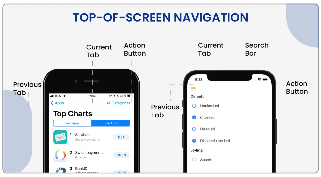
The navigation drawer is a slide-out menu accessible by tapping the hamburger icon on the top-left corner of the screen. The user can move between different app levels by clicking on the links in the drawer.
On the other hand, iOS follows a tab-based navigation pattern, meaning the user can access different app features by tapping on the tabs at the bottom of the screen. The tabs are designed to represent the app’s main features, and each tab displays different content.
Design Elements
Another significant difference between Android and iOS app UI design is the design elements. Android follows the Material Design guidelines, emphasizing bold colors, shadow effects, and grid-based layouts. Material Design also includes specific design principles for animations, typography, and iconography.
iOS follows the Human Interface Design guidelines, which focus on using flat design elements, such as minimalist icons, sans-serif typography, and a limited color palette. The guidelines also emphasize using white space and a clear visual hierarchy to create a clean and simple design. (Read more about Should Your Startup Choose a Web App or a Mobile App?)
Button Placement
Typography
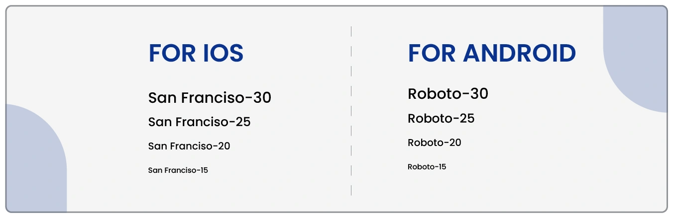
The typography is also significantly different between Android and iOS app UI design. Android devices use the Roboto font, a sans-serif font designed specifically for mobile devices. The font is intended to be easily readable on screens of various sizes and resolutions.
iOS devices use the San Francisco font, a sans-serif font designed specifically for mobile devices. The font is intended to be easily readable on screens of various sizes and resolutions, and it has a slightly larger x-height than other fonts to make it more readable on small screens.
Dive into Android vs iOS UI! Click to Compare Designs!
Explore our other insights!

how much does it cost to develop a virtual reality app like jaunt VR & google earth VR?
How much does it cost to develop a virtual reality app like Jaunt VR &Google earth VR? To

Should Your Startup Choose a Web App or a Mobile App?
Introduction In today’s digital age, startups must make a crucial decision when developing their products: Should they focus

HOW MUCH DOES IT COST TO DEVELOP A VEHICLE PARKING APP LIKE SMART PARKING?
How much does it cost to develop a vehicle parking app like Smart Parking? To develop a App
iOS vs. Android: App Icons and Screen Resolution
The screen structure in both systems is built using an 8dp grid, with the most common margins being 16dp.
This table displays the estimated size of icons produced for iOS apps with various screen resolutions.
These tables may appear intimidating initially, but everything becomes much simpler if you know the base size and can check and export at various greater multiples.
An application icon is a unique graphic for each app found on iOS and Android. The user typically decides whether or not to learn more about an application based on the app icon. A sound icon piques the user’s interest and is the crucial reason they download/purchase a program.
Each iOS icon is moulded in a square shape and then rounded off at the corners. Apple approves flat graphics without transparency and a simple background, removing unnecessary components like phrases, photos, and interface features.
On the other hand, Android icons can be transparent in the background and have any shape that suits the icon zone. (Read more about Which Ten Android App Development Trends Are the Most Popular?)
iOS vs. Android UX Design
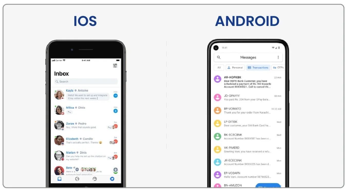
Different elements influence the design of the Android vs. iOS user experience. For example, if we look at LinkedIn, we can see that the display differs between iOS and Android.
For example, on Android, components such as contacts, new contacts, and nearby you are displayed at the top of the screen to make reaching crucial aspects easier and managing the network.
In iOS, there is a box that, when clicked, leads us to the next screen with all of the options. In iOS, there is also a floating button that allows us to add contacts through easy access.
Content Scrolling
When you browse through the content in iOS, the Navigation Bar reduces in width, and the Toolbar vanishes. However, iOS developers can generally align any behavior for content and bars while scrolling.
iOS and Android: Notifications
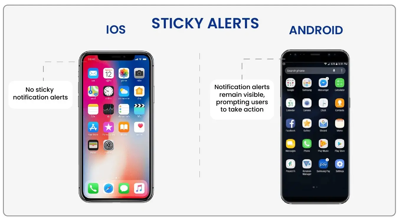
Android alerts use flat button styles, the proportions of which may be found in the material design guidelines. The action buttons are located in the alert’s bottom right corner. The “buttons” are purely text-based (all caps), making them easier to understand for consumers.
Dividers separate the activities in iOS notifications. They are primarily in sentence or title case, with structure provided by the individual blocks. They are put in the popup’s center and at the bottom.
Conclusion
Android and iOS app UI design has unique design guidelines that designers must consider while developing apps. For example, Android follows a hierarchical navigation pattern, uses bold colors and shadow effects, places buttons on the top of the screen, and uses the Roboto font.
In contrast, iOS follows a tab-based navigation pattern, uses flat design elements, places buttons at the bottom of the screen, uses the San Francisco font, and features more detailed and realistic app icons. By understanding these differences and comparisons, designers can create optimized apps for each platform and provide a seamless user experience.
FAQs
1. What is Android?
Android is an open-source mobile operating system primarily used on smartphones and tablets.
2. What is iOS?
iOS is a proprietary mobile operating system developed by Apple Inc. and used exclusively on Apple’s devices, such as the iPhone and iPad.
3. What are the key differences between Android and iOS app UI design?
The primary differences between Android and iOS app UI design are their design principles, UI components, and app layouts. Android apps typically feature a more customizable and flexible design focusing on material design principles. In contrast, iOS apps prioritize a consistent and intuitive design focusing on human interface guidelines.
4. What is material design?
Material design is a language developed by Google used in Android app UI design. It emphasizes using grid-based layouts, bold typography, and bright colours to create a cohesive and visually appealing user interface.
5. What are human interface guidelines?
Human interface guidelines are design principles developed by Apple that are used in iOS app UI design. They emphasize consistent layouts, clear and concise text, and intuitive navigation to create a seamless user experience.
6. What are some standard UI components used in Android app design?
Some standard UI components in Android app design include buttons, text fields, checkboxes, radio buttons, sliders, tabs, and navigation drawers.
7. What are some standard UI components used in iOS app design?
Some standard UI components in iOS app design include buttons, text fields, switches, sliders, pickers, and segmented controls.
8. Can Android apps be designed to look like iOS apps?
Yes, Android apps can be designed to look like iOS apps and vice versa. However, it is essential to note that each platform has unique design principles and guidelines that should be followed for optimal user experience.