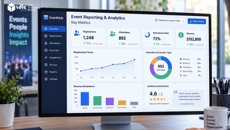
Most event teams still measure success with three numbers: how many people signed up, how many badges they printed, and whether the budget survived. Those numbers describe activity. However, they do not explain performance.
That gap is exactly where event reporting and analytics earns its keep. In short, the discipline collects registration, attendance and financial data across the full event lifecycle.
It then turns that data into metrics a marketing head, a finance controller and a sponsor can all act on. Get it right, and every event feeds the next one.
Get it wrong, and hallway feedback plus a headcount at the door become your only evidence. Meanwhile, the team repeats the same mistakes every cycle.
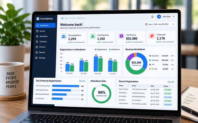
This guide walks through the metrics that matter in each of the three families, the formulas behind them, realistic benchmarks, and the reporting architecture that holds everything together.
The examples assume a mid-size conference or a recurring corporate programme. Still, the same model scales down to a single webinar and up to a multi-city roadshow.
- 3Metric families
Registration, attendance and financial performance.
- 5Reporting checkpoints
From the demand check at T-60 to the financial close.
- 4Systems to join
Registration, check-in, CRM and finance data.
- 3Dashboard views
Executive, organiser and sponsor, on one model.
What Event Reporting And Analytics Actually Means
Teams often use reporting and analytics as if they meant the same thing. In fact, the difference decides how useful your dashboard will be.
Reporting answers what happened. It counts registrations, check-ins, ticket revenue and expenses, then presents them in a fixed structure that stakeholders read without training.
Analytics answers why it happened and what to do next. For example, it compares this event to the last four, isolates the channel that produced the cheapest qualified attendee, and flags the slot where drop-off spikes.
A workable programme needs both layers. Reporting keeps the organisation honest about outcomes, while analytics stops it repeating the same mistakes.
Most teams over-invest in the first and skip the second. As a result, event data piles up and nobody ever reads it.
The short version: registration metrics show whether your demand generation worked, attendance metrics show whether your experience and logistics worked, and financial metrics show whether the event deserved its budget.
Therefore, a report that covers only one family will mislead whoever receives it.
The Three Metric Families That Decide Event Success
Every meaningful event KPI belongs to one of three families. Above all, keeping them separate stops a report from becoming a wall of numbers nobody reads past slide two.
- Family 01Registration
Demand signals that arrive before the event runs: sign-up volume, pace, conversion, source and drop-off. Crucially, these are the only metrics you can still act on while time remains.
- Family 02Attendance
Delivery signals that arrive during the event: show-up rate, check-in throughput, session participation and engagement depth. Together, they reveal whether you kept the promise you made at registration.
- Family 03Financial
Value signals that span the whole lifecycle: revenue mix, cost per attendee, break-even point, ROI and influenced pipeline. Ultimately, these decide whether the event runs again next year.
How The Three Families Connect
The families run in sequence rather than in parallel. A weak registration funnel caps attendance, however strong the programme turns out to be.
Weak attendance then drags down every financial ratio that uses attendee count as a denominator. To see it clearly, hold everything else constant and move a single number.
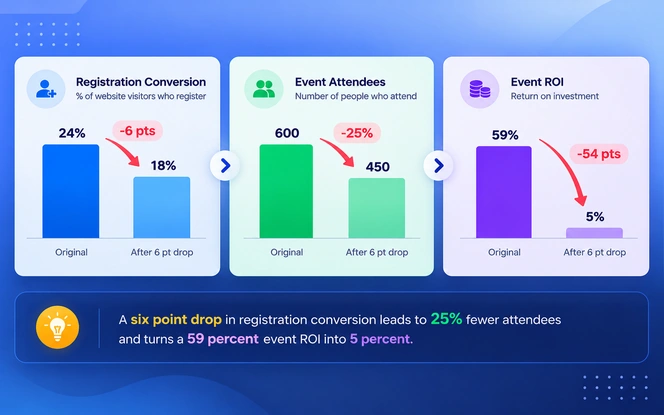
Six points of conversion cost sixty-eight attendees. Consequently, cost per attendee climbed from 107 to 162, and almost the entire return disappeared.
Nothing in the venue, the programme or the budget went wrong. Because every downstream number inherits the error, registration deserves a weekly review rather than two checks at launch and close.
By the time cost per attendee looks strange, in fact, the cause is already forty days old.
Registration Metrics: Measuring Demand Before The Doors Open
Registration data predicts event performance earlier than anything else. Moreover, it is the only data set you can still influence while the event sells.
Teams that review registration weekly, rather than only at launch and at close, consistently correct course faster.
Registration Volume And Pace
Volume counts completed sign-ups. Pace tells you more: registrations per week, plotted against the same week in your previous cycle.
A campaign thirty percent behind pace at T-45 is a fixable problem. At T-7, however, the same gap becomes a budget conversation.
Late registration is now common, so compare pace with care. Freeman's 2025 End-of-Year Recap reported that about half of the events it tracked ran behind their usual registration pace in 2025.
Registration Conversion Rate
This metric shows the share of people who reached the registration page and finished the form. Above all, it separates a traffic problem from a form problem.
Low traffic with high conversion means the campaign needs reach. Conversely, high traffic with low conversion means the form, the pricing or the page copy loses people.
For a reference point, Bizzabo's 2026 State of Events benchmark data, drawn from 2025 in-platform events, puts average visit-to-registration conversion at 21.5%.
In the same dataset, dynamic registration flows converted at 24.4%, while static flows reached only 11.6%. Form design alone can roughly double the rate.
Form Drop-Off And Abandonment
Every extra required field costs you registrants. Field-level drop-off shows precisely where people exit, and the answer rarely surprises anyone once the numbers arrive. The usual offenders are:
- Payment steps that add a second page or an unexpected fee.
- Job-title dropdowns with fifty options and no search.
- Mandatory phone numbers that the event never actually uses.
Our guide to custom event registration forms and workflows covers how to trim fields without losing the data sponsors need.
For the checkout step specifically, see event registration and payment processing features. Also, treat abandoned registrations as a recovery list rather than a loss.
Channel And Source Attribution
Tag every registration link with campaign parameters. Then rank channels by cost per registration instead of raw volume.
The channel that delivers the most sign-ups often fails to deliver the attendees who show up. That distinction surfaces only when registration source travels forward into attendance data.
Audience Composition
Job title, seniority, company size, region and industry turn a headcount into an audience profile. Sponsors buy the profile, not the number.
Suppose eighty percent of your registrants are individual contributors while your package promised decision-makers. In that case, you need to know before the sponsor works it out on the floor.
| Metric | How it is calculated | What it tells you |
|---|---|---|
| Registration volume | Count of completed registrations | Raw demand and capacity planning baseline |
| Registration pace | Registrations per week vs. prior cycle | Whether the campaign runs ahead or behind schedule |
| Conversion rate | Completed registrations / page visitors | Whether the problem is reach or the form itself |
| Form drop-off rate | Started but not completed / started | Which field or step loses registrants |
| Cost per registration | Channel spend / registrations from that channel | Which channels deserve more budget |
| Invite-to-register rate | Registrations / invitations sent | List quality and message relevance |
You already collect the event data. Nobody reads it.
Talk to our team about turning registration, check-in and finance data into one reporting layer your stakeholders will actually open.
Book a free consultationAttendance Metrics: Measuring Who Actually Showed Up
Registration is a promise, and attendance is the delivery. The attendance rate measures the distance between the two.
For most organisations, meanwhile, that single number gets less scrutiny than anything else in the report.
Attendance Rate And No-Show Rate
Attendance rate captures the share of registrants who checked in. No-show rate inverts it, and leadership reacts to each differently, so report both.
Free virtual events routinely lose a large share of registrants, whereas paid in-person events hold far more. Therefore, judge your number against your own format and history.
- Paid in-person conferenceTypically high
- Free in-person meetupTypically moderate
- Paid virtual summitTypically moderate
- Free webinarTypically low
The bars show a relative pattern across formats rather than a benchmark to copy. Instead, set your own baseline from your last three events of the same type.
Published Benchmarks For Attendance, Conversion And No-Shows
Published figures give that baseline a sanity check. The ranges below come from Freeman and Bizzabo, and each carries the date of the data behind it.
| Benchmark | Published figure | Source and date |
|---|---|---|
| Attendance rate, mixed event portfolios | 52% on average, from 412 registrations and 269 attendees per event | Bizzabo, 2025 platform data, published March 2026 |
| Attendance rate, virtual events | 50% of registrants attended, down from 54% earlier that year | Bizzabo, Q3 to Q4 2020 data |
| No-show rate, in-person shows | Registered-but-absent attrition near 50% after the pandemic, against about 20% before it | Freeman, September 2022 |
| Registration conversion | 21.5% visit to registration; 24.4% on dynamic flows and 11.6% on static flows | Bizzabo, 2025 platform data, published March 2026 |
| Registration pace | About half of tracked events ran behind their usual pace | Freeman End-of-Year Recap, 2025 data |
Read these as ranges, not targets. Each dataset uses a different event mix, and the virtual figure predates the return of in-person events.
Your own history therefore stays the primary baseline, with these numbers acting as a check on whether it looks unusual.
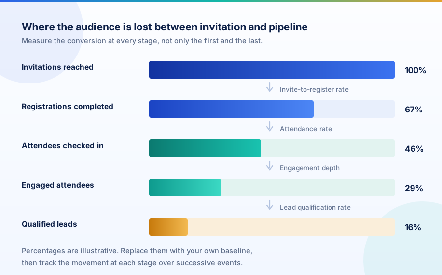
Each stage in that funnel leaks for a different reason. Invitations fail on list quality, registrations fail on no-shows, and check-ins fail when sessions do not hold attention.
So give every stage its own owner, rather than one blended conversion number that nobody can act on.
Check-In Speed And Onsite Throughput
Check-in gives attendees their first physical contact with your operation. People remember a long queue long after they forget the keynote.
Median check-in time per attendee and peak-hour throughput both belong in the operations report. Once you measure throughput, badge printer counts and staffing levels stop being guesses.
For the operational setup behind those numbers, read our guide on event check-in, badge printing and attendance tracking for operations.
Session Attendance And Dwell Time
Room-level or stream-level data shows which sessions earned attention and which ones lost the slot to something stronger. Here, dwell time matters far more than headcount.
A session that drew three hundred people who left after eight minutes performed worse than one that held eighty people for a full hour. Only dwell time reveals that.
If your agenda runs parallel tracks, the guide on how to manage multi-session events, workshops and breakout sessions explains how to capture room-level data cleanly.
Engagement Depth
Engagement moves analytics past attendance counting. Poll responses, audience questions, app sessions, booth scans, meeting requests and downloads together show how invested each attendee was.
The tools that generate these signals are covered in our guide to event engagement tools: apps, surveys and networking.
Many teams score these signals, then use the score to prioritise post-event follow-up. This is also where AI for event management starts to pay off.
- 1
Check-in rate by ticket type: spot which pricing tiers people buy and then skip.
- 2
Session fill rate: attendees present against room capacity, slot by slot.
- 3
Average sessions per attendee: breadth of participation across the agenda.
- 4
Booth or sponsor scan count: the number your sponsors ask for first.
- 5
Day-two return rate: the most honest satisfaction metric a multi-day event has.
- 6
Survey response rate: the credibility check on every qualitative finding.
Weighting The Engagement Score
One caution on engagement scoring: a composite score is only as good as its weights. Therefore, review those weights with sales rather than setting them inside the events team alone.
A booth scan and a demo request do not carry equal value. Treating them equally, meanwhile, quietly inflates every downstream number.
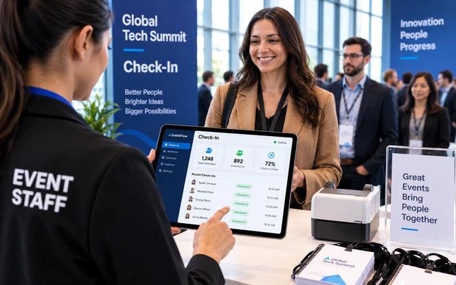
When check-in data streams live, the floor team can open an extra lane before the queue forms. It also lets you release no-show seats to a waitlist while the event is still running.
Financial Performance Metrics: Measuring What The Event Returned
Financial reporting decides whether event teams keep their budget or lose it. The metrics themselves are simple arithmetic.
The difficulty sits elsewhere: agreeing what counts as a cost, what counts as revenue, and how far downstream you may claim credit.
Gross Revenue And Revenue Mix
Gross revenue combines several streams. Reporting the mix instead of the total makes the number strategic.
- Ticket sales
- Sponsorship packages
- Exhibitor fees
- Merchandise and paid add-ons
An event drawing seventy percent of revenue from two sponsors carries a very different risk profile from one that two thousand ticket buyers paid for. Both, however, can land on the same total.
Total Cost And Cost Per Attendee
Total cost should cover every line that made the event happen, including the spend that filled the room:
- Venue hire
- Catering
- Production and AV
- Staffing and staff time
- Technology and licences
- Travel
- Marketing and campaign spend
Teams most often drop the marketing line, which flatters ROI. Cost per attendee then becomes the comparison metric that works across events of different sizes.
Event ROI And Break-Even Point
ROI expresses net return against spend. Break-even tells you how many attendees or how much sponsorship the event needed before it stopped losing money.
During planning, break-even proves the more useful of the two.
Pipeline Influence And Revenue Attribution
For B2B events, ticket revenue rarely matters. The real return sits in influenced pipeline, which only becomes measurable once attendee records match back into the CRM.
That matching depends on clean system links, which our article on ERP with CRM integration covers in detail. Teams on Salesforce usually pair it with Salesforce implementation services.
Agree attribution with sales before the event rather than negotiating it afterwards. A defensible model credits influence on opportunities that open or advance inside a fixed window, and states that window openly.
Our sales and product analytics work applies the same attribution logic across the wider revenue funnel.
| Metric | Formula | Why it belongs in the report |
|---|---|---|
| Gross revenue | Tickets + sponsorship + exhibitors + add-ons | Shows total commercial scale and revenue concentration risk |
| Net profit | Gross revenue - total cost | The number finance will quote back to you |
| Event ROI | ((Revenue - cost) / cost) x 100 | Makes events comparable against other marketing spend |
| Cost per attendee | Total cost / checked-in attendees | Normalises efficiency across events of different sizes |
| Cost per qualified lead | Total cost / qualified leads captured | The metric that survives a demand-generation review |
| Revenue per attendee | Gross revenue / checked-in attendees | Tests pricing and upsell performance |
| Sponsorship retention rate | Renewing sponsors / prior-year sponsors | The clearest signal that sponsors got value |
| Break-even attendance | Fixed costs / (price - variable cost per attendee) | Sets the floor before tickets go on sale |
Stop rebuilding the same event report in a spreadsheet
We build custom reporting layers that connect your registration platform, check-in system, CRM and finance data into one source of truth.
Get a custom analytics roadmapBuilding The Reporting Layer: From Raw Data To A Single Dashboard
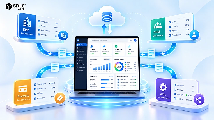
Metrics fail in practice for a boring reason: the data lives in five systems that never talk to each other.
- Registration sits in the event platform.
- Check-ins sit in the badge scanner.
- Spend sits in the finance system.
- Leads sit in the CRM.
- Behaviour sits in the web and app analytics tool.
Until those systems share one attendee identifier, someone assembles every report by hand, and every number lands slightly wrong.
Our guide to event management system integration: ERP, CRM, payments and APIs shows how those connections are usually built.
If you are still choosing tooling, check reporting depth first in the event management platform buyer's guide: how to choose.
Step One: Fix The Identifiers
Pick one key, usually the registration ID, and push it into every downstream system. Email addresses look like a shortcut and behave like a trap.
People register with a work address, then scan a badge that carries a personal one. Identity resolution is unglamorous, yet it decides whether the rest of the stack earns trust.
Step Two: Build The Data Model
A simple event data model needs four core tables. Everything else becomes a view on top.
- Events
- Registrations
- Attendance activity
- Financial transactions
Resist the urge to model every edge case in version one. After all, a model that answers eighty percent of questions this quarter beats a perfect one that ships next year.
This modelling work sits at the core of our data analytics services.
Step Three: Split The Dashboard By Audience
One dashboard cannot serve three audiences. Therefore, build three views over one model:
- Executives want ROI, attendance rate and pipeline influence on a single screen.
- Organisers want pace, drop-off, session fill and check-in throughput.
- Sponsors want scans, lead quality and audience profile.
Most teams deliver these through business intelligence services and solutions. Teams building in-house can start with how to build a dashboard with React and Chart.js.
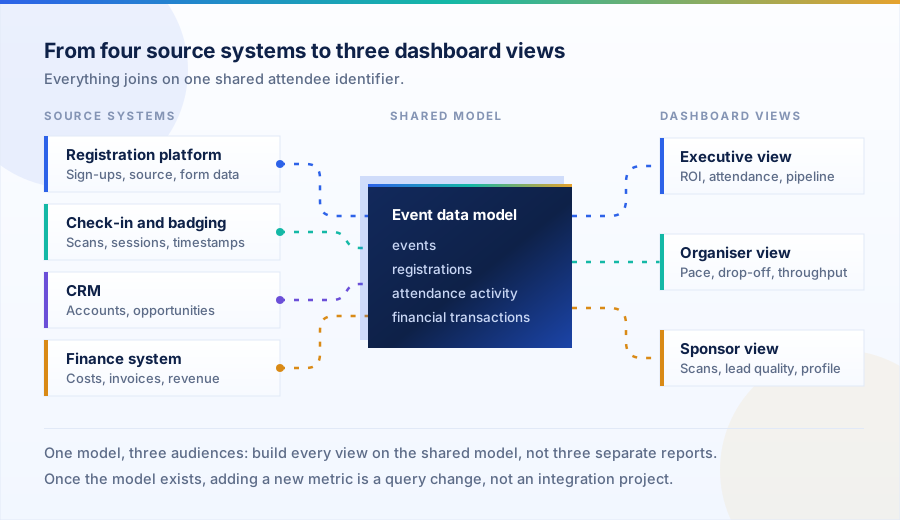
Once the model exists, the marginal cost of a new metric drops to almost nothing. In practice, the second event costs a fraction of the first to report on, and the tenth runs close to automatic.
Reporting Cadence: What To Review Before, During And After The Event
A single post-event report arrives too late to change anything. Instead, split reporting into five checkpoints, and analytics becomes an operating rhythm.
T-60 To T-30: Demand Check
Registration pace against the prior cycle, cost per registration by channel, and early audience composition. This is your last comfortable window for moving campaign budget.
T-14 To T-7: Readiness Baseline
Lock the registration forecast, apply your expected attendance rate to it, confirm catering and room capacity, then launch the abandoned-registration recovery campaign.
Event Days: Live Operations
Check-in throughput by hour, live attendance rate, session fill and queue alerts. Because this reporting is operational, it should refresh in minutes rather than days.
T+2 To T+5: First Read
Attendance rate, session performance, engagement scores, lead counts and survey responses, while memory stays fresh. Sponsors expect their numbers inside this window.
T+30 To T+90: Financial Close
Reconcile final costs, calculate ROI, measure pipeline influence against the agreed attribution window, then write the findings into the brief for the next event.
Common Reporting Mistakes That Distort Event Performance
Most bad event reports fail for a reason other than arithmetic. Typically, someone made a definition decision months earlier and never wrote it down.
Four Definition Errors Worth Fixing First
- Reporting registrations as attendance
Decks use the two numbers interchangeably, which then inflates every per-attendee ratio underneath them.
Report both, always adjacentShow registrations, check-ins and the attendance rate together, so the gap stays visible instead of hiding.
- Excluding marketing spend from cost
ROI that rests on venue and catering alone flatters the event and misleads the budget conversation.
Use fully loaded costInclude campaign spend, staff time and technology, so the ratio survives scrutiny from finance.
- Changing metric definitions between events
Year-on-year comparison collapses whenever someone redefines a qualified lead halfway through.
Keep a written metric dictionaryVersion it, date it, and note every change as soon as a definition moves.
- Averaging away the outliers
An average satisfaction score of 4.1 hides the two sessions that scored 2.0 and now need replacing.
Report distribution, not just the meanInclude the range and the bottom quartile, so weak sessions surface instead of disappearing.
Ready to measure your events properly?
Share your current stack and reporting pain points. We will map the data you already have against the metrics your stakeholders keep asking for.
Start your event analytics projectHow SDLC Corp Helps Teams Build Event Reporting And Analytics
We build the reporting layer underneath event programmes: the integrations, the data model, the dashboards and the automated distribution that puts numbers in front of the right people.
Engagements usually start with a data audit and a metric dictionary. Then they move to a working dashboard within a single quarter.
- Data Analytics ServicesData engineering, warehousing and visualisation work that turns event source systems into one queryable model.
- Business Intelligence Services and SolutionsDashboard design, reporting automation and BI platform implementation for executive, organiser and sponsor views.
- Software Development CompanyCustom platforms for when off-the-shelf event tooling cannot cover your registration or reporting requirements.
- Backend Development ServicesAPIs, integrations and data pipelines that connect registration, check-in, CRM and finance systems reliably.
- How To Create An App Like EventbriteA practical breakdown of building a ticketing and registration product, including the analytics layer.
- Certified Salesforce Development CompanyCRM integration work so attendee records map cleanly to opportunities and influenced pipeline.
For wider market context, the analyst view stays consistent. Mordor Intelligence and MarketsandMarkets both place analytics and event intelligence among the fastest-growing segments of the event software market.
Vendors, meanwhile, keep shifting their emphasis from execution tooling towards revenue attribution.
Frequently Asked Questions
What Are The Most Important Event Reporting Metrics To Track?
Start with six: registration volume, conversion rate, attendance rate, cost per attendee, event ROI and influenced pipeline. Together they cover demand, delivery and financial return. Add session-level and engagement metrics once those basics hold up.
What Is A Good Event Attendance Rate?
It depends on format and price. Bizzabo's 2025 platform data shows a 52% average across mixed event portfolios, and paid in-person events usually hold more registrants than free virtual ones. Benchmark against your own past events and watch the trend.
How Is Event ROI Calculated?
Event ROI equals gross revenue minus total cost, divided by total cost, expressed as a percentage. What you put into total cost matters most: venue, production, staffing, technology, travel and marketing. B2B teams also report influenced pipeline.
What Is The Difference Between Event Reporting And Event Analytics?
Reporting describes what happened through a fixed set of counts and ratios. Analytics explains why, by comparing events, segmenting audiences and isolating drivers. In short, reporting informs stakeholders, while analytics changes the next event.
Which Systems Need To Be Connected For Accurate Event Analytics?
At minimum, connect the registration platform, the check-in system, the CRM and the finance system. Add web analytics and the event app where they exist. Above all, every system must share one attendee identifier.
How Soon After An Event Should The Report Be Delivered?
A first read covering attendance, engagement and lead counts should reach stakeholders within a week, because sponsors and sales act on it immediately. The financial close usually lands thirty to ninety days later.
Can Event Analytics Be Automated?
Yes, and it should. Once identifiers stay consistent and the data model exists, dashboards refresh on a schedule and distribution runs itself. Interpretation remains the manual part, which is where human time pays off.